How to Draw Throw-Up Graffiti Letters (Step by Step)
Learn how to draw graffiti throw-ups: the bubble-letter skeleton, overlaps, fill, outline and highlights, plus the mistakes that make throwies look stiff.
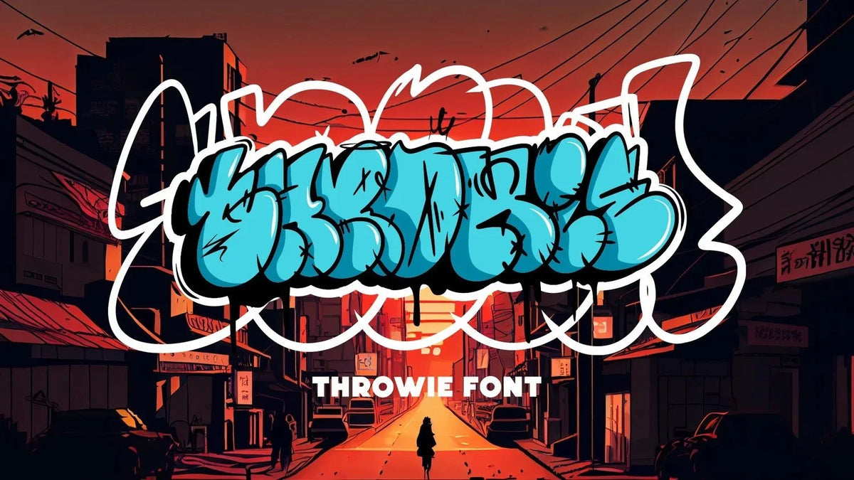
A throw-up (or "throwie") is a quick graffiti piece: two or three fat, rounded bubble letters, a fill, and an outline wrapped around the whole word. To draw one, sketch your word as a simple skeleton, inflate each letter into a round bubble shape, let the letters overlap, then add a fill, an outline around the whole word and a few highlights. Speed is the point, so the best throwies use as few strokes as possible.
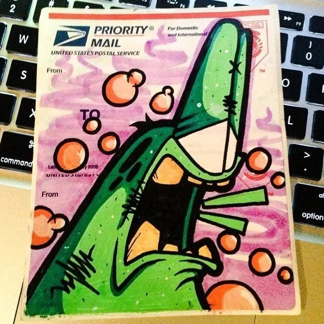
I've been drawing throw-ups since high school, when classmates would ask me to put their names in graffiti in their notebooks (my graffiti name back then was Fawx). Years later I turned my own throw-up style into a typeface, the Throwie font. Here's the process I use, letter by letter.

What makes a throw-up different from other graffiti
There are three classic graffiti styles, and they're built for different jobs:
Tags are signatures: one color, one line, done in seconds.
Throw-ups are a step up: bubble letters with a fill and an outline, done in a minute or two with two colors.
Pieces (short for masterpieces) are full productions: wildstyle letters, 3D, backgrounds, characters, hours of work.
A throw-up sits in the middle. It needs to read from across the street, but it also needs to be fast. That's why throwie letters are round and simple. Sharp corners and complex arrows slow you down and fight the bubble look. If you want the bigger picture of graffiti styles, I break them all down in graffiti logos: styles and examples.
What you need
Paper and a pencil for skeletons. A cheap sketchbook is perfect.
A fine liner (0.5 or 0.8) for the final outline.
Markers in two or three colors: one for the fill, one dark for the outline. Paint markers work too.
Or Procreate or any drawing app. I sketch most of my letters in Procreate now. The steps are the same.
Step 1: Pick a short word
Throw-ups work best with two to four letters. Most writers use their name or a short version of it. Longer words get hard to keep round and tight. If your name is long, use the first letters or a nickname.
Look for letters that play well together. Round letters like O, S, C, B, D, P and R are the easiest to bubble. Letters with lots of straight lines and points, like K, W, M and Z, take more practice to soften.
Step 2: Draw the skeleton
Write the word in simple single-line capitals, spaced closer than normal. This is your skeleton, the bones every bubble is built around.
Keep the letters about the same height.
Leave just enough room between them that each one will overlap its neighbor once it gets fat.
Don't worry about style yet. A clean skeleton makes everything after it easier.
Step 3: Inflate every letter
Now draw a rounded outline around each skeleton line, like you're blowing the letter up into a balloon. This is where a throwie gets its look.
Round every corner. No points. Even the corners of an E or a K should curve.
Keep the strokes thick and even. Thin parts look weak in a throw-up.
Shrink the holes. The inside counters of A, B, D, O, P and R should be small slits or ovals. Big holes make letters look skinny.
Let letters overlap. The first letter can sit in front of the second, or the other way around. Overlaps tie the word together so it reads as one shape instead of separate letters.
When I built the Throwie font, the hard part wasn't any single letter. It was making the letters flow as a word. Leaning letters into each other and letting one tuck behind the next is what makes it feel like a throw-up and not a row of balloons.

Step 4: Add bounce
Perfectly straight throw-ups look stiff. Give the word some movement:
Bounce the baseline. Lift one letter a little, drop the next.
Vary the size slightly. Make the first letter a bit bigger, or make the middle letters squeeze together.
Tilt a letter or two. A small lean adds energy.
Keep it subtle. Too much bounce and the word gets hard to read.
Step 5: Fill it
Fill the letters with one solid color. Fill comes before the outline in real throw-ups because it's faster: you fill loosely, then the outline cleans up the edges.
Popular fills are chrome (silver) and white because they pop off almost any wall, but any bright color works on paper. If you're drawing digitally, keep the fill flat for now.
Step 6: Outline the whole word
This is the line that makes it a throw-up. Draw a second outline around the outside of the entire word, not around each letter. It wraps the overlapping letters into one shape.
Use your darkest color.
Keep the line confident and even. One smooth pass looks better than many short strokes.
Some writers add a third, outer outline in another color, sometimes called a cloud or a force field. It's optional, but it makes the word pop off busy backgrounds.
Step 7: Highlights, drips and details
A few small details make it look finished:
Highlights: short white curved lines on the top left of each letter, like light hitting a balloon. In my Throwie style I use small inner highlight marks on every letter.
Drips: a couple of paint drips off the bottom.
Shine marks: a small sparkle or plus sign.
A shadow (optional): a solid offset shape behind the word for depth.
Stop before it gets busy. A throw-up should still read in a second.
Common throw-up mistakes
Letters that don't touch. Gaps make the word fall apart. Overlap them.
Big holes in the letters. Shrink the counters.
Sharp corners. Round everything.
Outlining each letter separately. Wrap the whole word.
Too many details. Throwies are about speed and impact, not decoration.
Words that are too long. Two to four letters is the sweet spot.
How to practice
Draw the same word every day for a week. Each time, try one change: tighter overlaps, smaller holes, more bounce, a different letter in front. You'll find your own style faster by repeating one word than by drawing a different word every time.
Look at your work from across the room, too. If you can't read it from there, simplify.
Want the shortcut? Use a throw-up font
If you need throw-up lettering for a design, a flyer or a quick mockup, a font gets you a clean base in seconds. That's why I built mine. With the Throwie font you type any word and get round, overlapping throw-up letters you can recolor, outline and drip by hand. It comes as a full A to Z alphabet for personal projects, and there's a commercial license for business use.
If you want a one-of-a-kind throw-up for your brand, crew or band, that's my custom lettering work. I also break down how a font like this is built in how to make a graffiti font.
FAQ
What is a throwie in graffiti?
A throwie is short for throw-up: a fast graffiti piece made of round bubble letters with a fill and an outline around the whole word. It's bigger than a tag but much quicker than a full piece.
How many colors does a throw-up use?
Usually two: one for the fill and one for the outline. Some writers add a third color for an outer outline or highlights.
What's the difference between a throw-up and bubble letters?
All throw-ups use bubble letters, but not all bubble letters are throw-ups. A throw-up packs the letters tight with overlaps, uses tiny counters, adds bounce and wraps the whole word in one outline, so it reads as one shape built for speed.
What letters are hardest to draw as a throw-up?
Letters with lots of points and straight lines, like K, M, W, X and Z. Round off every point and keep the strokes thick, and they'll sit with the rest of the word.
Can I use a throw-up font for my business logo?
Yes, as long as the font's license allows commercial use. My Throwie font has a personal-use download and a separate commercial license. For a logo you want to own outright, a custom graffiti logo is the better route.
Need this done for your brand?
Start a project